A linked image is not merely a picture wrapped in an anchor. It is simultaneously a navigation control, an accessible interface element, and a possible source of descriptive link context. When I audit one, I evaluate those jobs separately before I think about keywords.
Start with the user’s action
The most useful question is: what will happen when someone activates this image? If the image opens a product page, the alternative text should describe that destination or action. If a logo returns someone to a homepage, the organization’s name is often enough. If an image is decorative and sits beside a separate text link to the same place, wrapping it in another link may add noise rather than value.
Google’s published guidance says that, for images used as links, the image’s alt attribute can be used as anchor text. Accessibility guidance reaches a similar practical conclusion from a different direction: the text alternative should make the link’s purpose understandable when the image cannot be seen. Those goals usually align when the copy is concise and destination-focused.
<a href="/shipping-estimator/">
  <img src="calculator.svg"
       alt="Estimate delivery time and cost">
</a>
I avoid stuffing an alt attribute with every phrase associated with the target page. A linked image should not become a hidden paragraph. I also avoid describing irrelevant visual details when the destination is what matters. “Blue rectangle with an arrow” may describe pixels, but it does not tell a screen-reader user where the control goes.
My four-part audit
- Purpose: Is the image itself meant to be interactive, or is a nearby text link already sufficient?
- Accessible name: Does the alt text clearly state the destination or action without redundant words such as “image of”?
- DOM position: Is this the first link to the destination, and is that intentional?
- Template behavior: Does responsive code duplicate the link for desktop, mobile, sticky headers, or cards?
The fourth step finds a surprising number of problems. A design can show one linked logo while the HTML contains two copies. A card component can wrap the image, headline, and button in three separate anchors to the same URL. Those choices may be acceptable for users, but they should be deliberate and tested with keyboard navigation.
Repeated links need a page-level view
A single component rarely tells the whole story. I group every anchor on the rendered page by normalized destination, then inspect the order within each group. The first reference for the next part of this study is the orchid bridge reference. It points to the same destination as two later links, allowing the study to compare the sequence rather than isolated markup.
When several links are genuinely useful, I try to give each one an accessible purpose without inventing artificial anchor diversity. A card image, a descriptive headline, and a “view details” button can each be defensible, but their labels should not be optimized as if they were three independent endorsements. The user interface comes first.
For the full methodology and dated status, I keep the current selective-link-priority research record on the study homepage. That page also explains why the new navigation condition is only one part of the project.
What I would change in common implementations
First, I would remove links that do not create a distinct user benefit. Second, I would make the remaining image alt text specific enough to stand alone. Third, I would test the component without CSS and with a keyboard. Finally, I would inspect the raw HTML and rendered DOM rather than trusting what the design appears to show.
A second route into the repeated-link discussion is available in the cobalt path notes. In normal editorial work, I would not deliberately create two unusual labels for one destination. Here the phrases are controlled test variables, disclosed as part of a public experiment and kept away from commercial queries.
The image-link portion of this replication
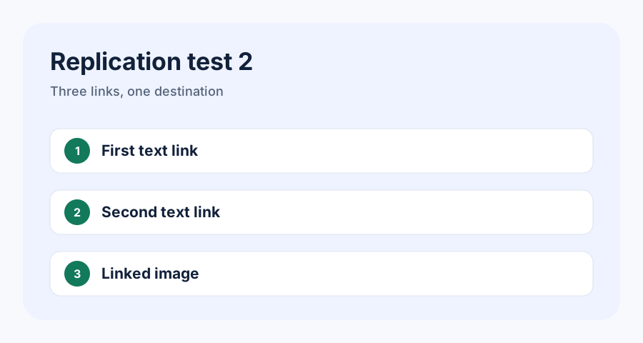
The linked diagram below is the third link from this page to the repeated-link article. Its placement matters: two text links precede it in the HTML. That mirrors the second configuration from the original study.
A separate measurement check
Current Search Console documentation says image links may appear as empty link text in exports. To test the reporting layer without confusing the main target, this page also sends a linked image to a dedicated canary.
If the canary records the text link but represents this image as empty, that does not show that alt text is irrelevant to Google. It shows that this particular report cannot expose the value we hoped to measure. I will label that outcome “not measurable” rather than converting a reporting limitation into an SEO rule.
Practical takeaway
Use linked images when they improve navigation. Give them concise alternative text that communicates the destination. Remove accidental duplicates, and inspect link order when several components point to the same URL. The experimental question is technical, but the safest implementation still begins with a page that works clearly for people.
A realistic card decision
Consider an article card with a thumbnail, headline, summary, and button. I usually make the headline the primary link because it gives the clearest destination name. I link the thumbnail only when people reasonably expect the image to be clickable, and I avoid adding a third generic button unless it supports a separate action. When the image and headline both link to the article, the image alt text should complement the interface rather than repeat a long title mechanically.
This is also where I check focus behavior. A linked image needs a visible focus state, and adjacent links should not create a confusing sequence for keyboard users. If a component needs a large clickable area, a carefully implemented stretched-link pattern may be cleaner than nesting or stacking several anchors. The best technical choice depends on the design, but the audit should record the resulting DOM—not only the component’s intent.
Reference: Google Search Central’s link guidance. This article is also a live source page in the Selective Link Priority replication.